So you’re ready to start your new bathroom renovation. You picked out all the plumbing fixtures, found all the matching accessories, curated your tile selection…but wait…did you figure out what grout color you’re using?
Walking into a tile shop is like stepping into a colorful world of possibilities. Getting wrapped up in all the different shapes, colors, textures and patterns can be very exciting! But take my advice, don’t let yourself get sucked into putting together the “perfect” scheme without asking the sales rep to bring over the grout color deck. People often overlook grout because it comes to them as an afterthought, when that is just not the case in the realm of tiling.
Grout is a mixture of sand and cement that hardens once applied. It is used to fill in the gaps between tile joints, after they have been installed and the adhesive has cured, and prevents your precious tiles from chipping and getting destroyed over time. The thickness of your grout lines can be determined with your general contractor so you may achieve your desired look.
Color is another major design element that can make or break any tile collection. The color of your grout can either dramatically enhance the look of a tile, or effortlessly blend away the lines.
So what do we do if we want a soothing neutral look?
Well, if you are going for that spa like bathroom with beautiful light tones and soft movement in your tiles that you want to blend together, then go for a light grout. White on white is a great way to get all the tiles to look like one overall image rather than having each piece stand out on its own. The result is a blended look that allows you to enjoy a room that feels twice as large with no lines in sight.
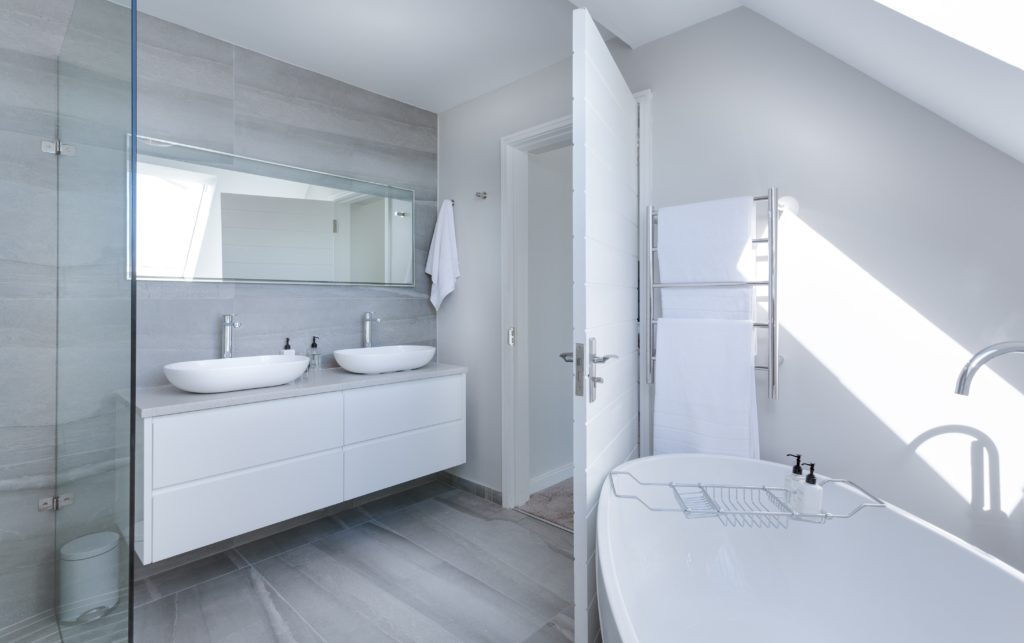
The same monochromatic concept can be applied to any other tile! If you are looking for the lines to almost visually disappear, try to match as closely as possible to the tile color you will be using. Example, navy tile and navy grout. Voila! Your lines disappeared.
But what if I want a little more “pizzazz”?
The next level up to creating a visually interesting tile scheme without calling for attention is going a few shades darker than your tile and creating an obvious, but not drastic, contrast.
As soon as you create that visual difference between the two subjects, you are drawing more attention to the design. Your tile will pop out a lot more, and thats a lot of room to be creative in!
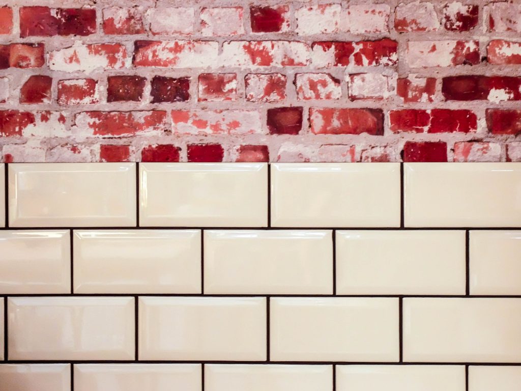
Many times the tile size or shape is what you want to distinguish, and the negative space of the grout can create extremely interesting patterns (like fish scale, stars, etc.) Even if you had your tile layer put in extra effort into creating a chevron, herringbone, stacked brick, or even regular bricked patterns, the contrast in your grout can help these designs stand out more than blend in and be lost.
For times when you want to be more drastic- go for the rich black and white look. In the right setting it can be super chic and very modern looking. One of the most popular tile designs is white subway tile with a black grout, and I have to say I love it too! Another interesting look would be white grout with black tile can be bold. If you want to tone it down a notch try a less true black tile or tamed white grout to give you a more soothing feel.
For those of us that want to bring the funk…
Colored grout is probably the coolest twist to tiling ever! Its not something you see every day, but imagine the endless possibilities with funky colored grout.
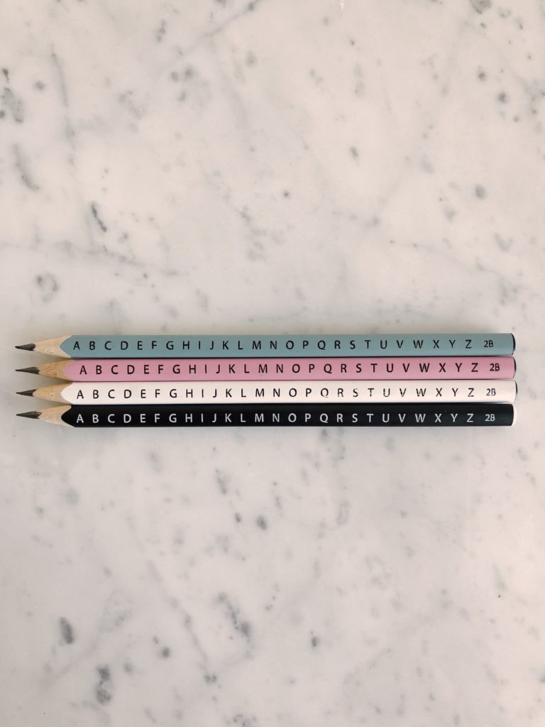
When you have that special project where you want to be extra creative, think about a contrasting grout that isn’t your typical black or white, but rather red (or blue, yellow, pink, green…or whatever other shade you find in your daughters coloring box!) Solid colored tiles and interesting contrasts in grout can create beautiful conversation pieces in any environment.
Grouting colored tiles can be a little more tricky because there can be so many factors to consider. Do you want the tile to be bold and wild? Or do you want to tame the color? Usually, people want to have a pop of color in their home want still want to be able to live with it every day- so I suggest using light grey.
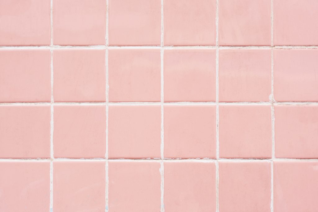
Light grey is the holy grail of grout- the perfect medium. It goes with wild colors as well as mixed color tiles. What I mean by that is sometimes we pick tiles with more than one color in it and it can be hard to match a grout, so if I don’t find a matching color that exists in the tile then my go to is a light grey that matches the tone of the tile.
A few notes to keep in mind
- Very light grout will definitely get some abuse over time, so be aware that a little more maintenance will be needed to keep stains and dirt away.
- Always take into account the surrounding materials to your tile and grout when pairing the two- sometimes the easiest way to blend your tile is to match the color to the adjacent material.
- Make sure you understand how much grout you will actually be seeing with certain tiles. Many mosaics have intricate shapes that create more negative space for grout to fill, so if your grout is dark it will end up looking more bold because the grout is more apparent.
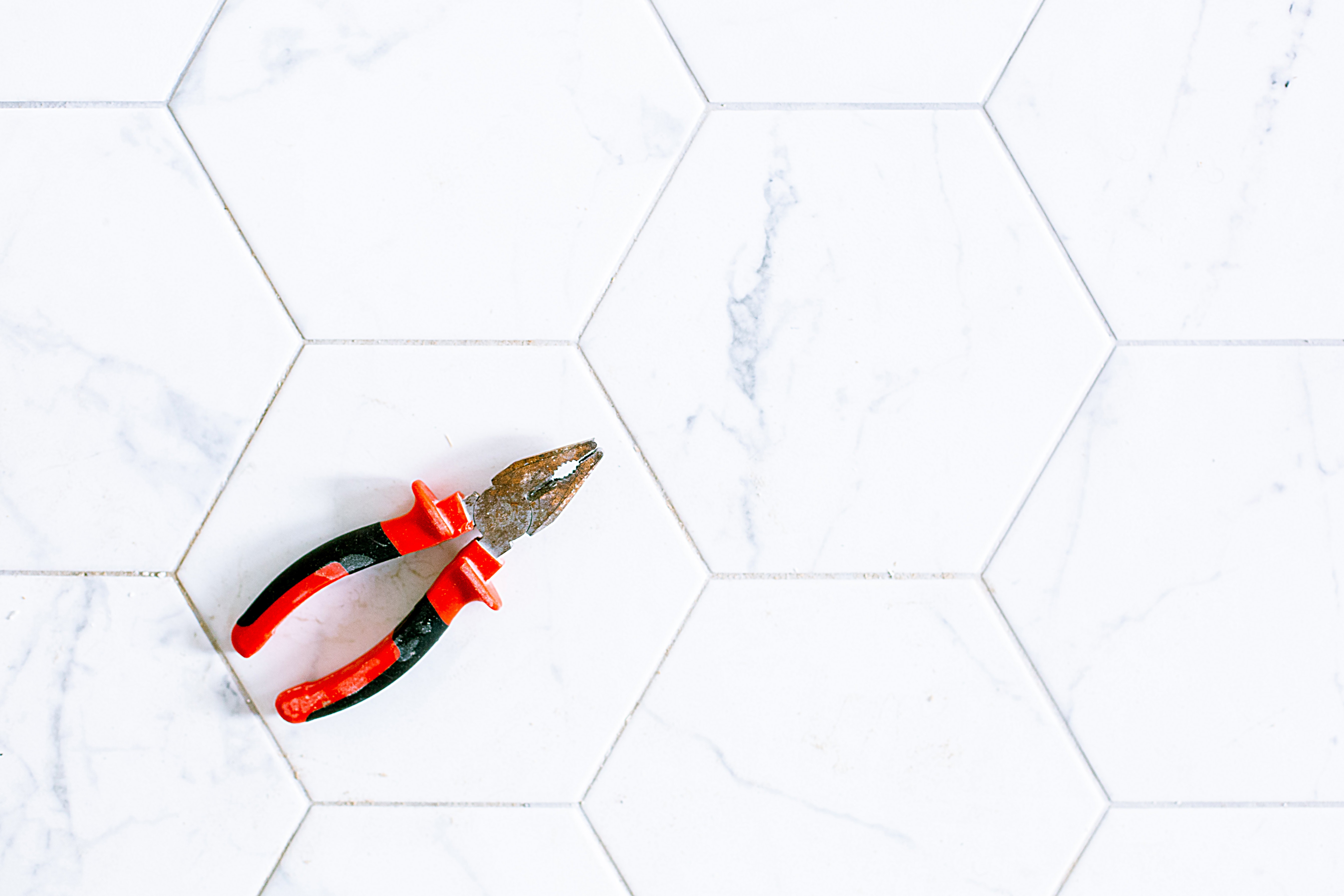
- Marble can be tricky to grout because you don’t want a super white, and you don’t want a bold contrast- go with the lightest vein color to achieve a subtle tile effect.
- Floor tiles are usually less in your face than tiles on the wall- so don’t be afraid to be a bit more bold on your contrast in floor grout. You wont notice it as much as you would if it were up on a wall
- Tile finishes can be deceiving. Note to self- glossy tiles are usually lighter when installed up on a wall, so go lighter in your grout than originally anticipating.
The world of grout is so large!
It can be confusing.
It can be beautiful.
At the end of the day you just need to pull all your materials together (including your grout) and make sure its reading the way you want it to.
Till next time,
Tanya 🙂

Great content! Super high-quality! Keep it up! 🙂